

.png)
.png)
Case Study: Rebranding an Aesthetic Surgery Clinic — Applied Art in Space
CASE STUDY — AUREAE
Rebranding, art direction and applied art
AUREAE starts from a problem common across the aesthetic medicine sector: standardized visual communication, built on patient photographs, promotional messaging and the graphic codes of the clinical world.
The project sets out to transform that perception.
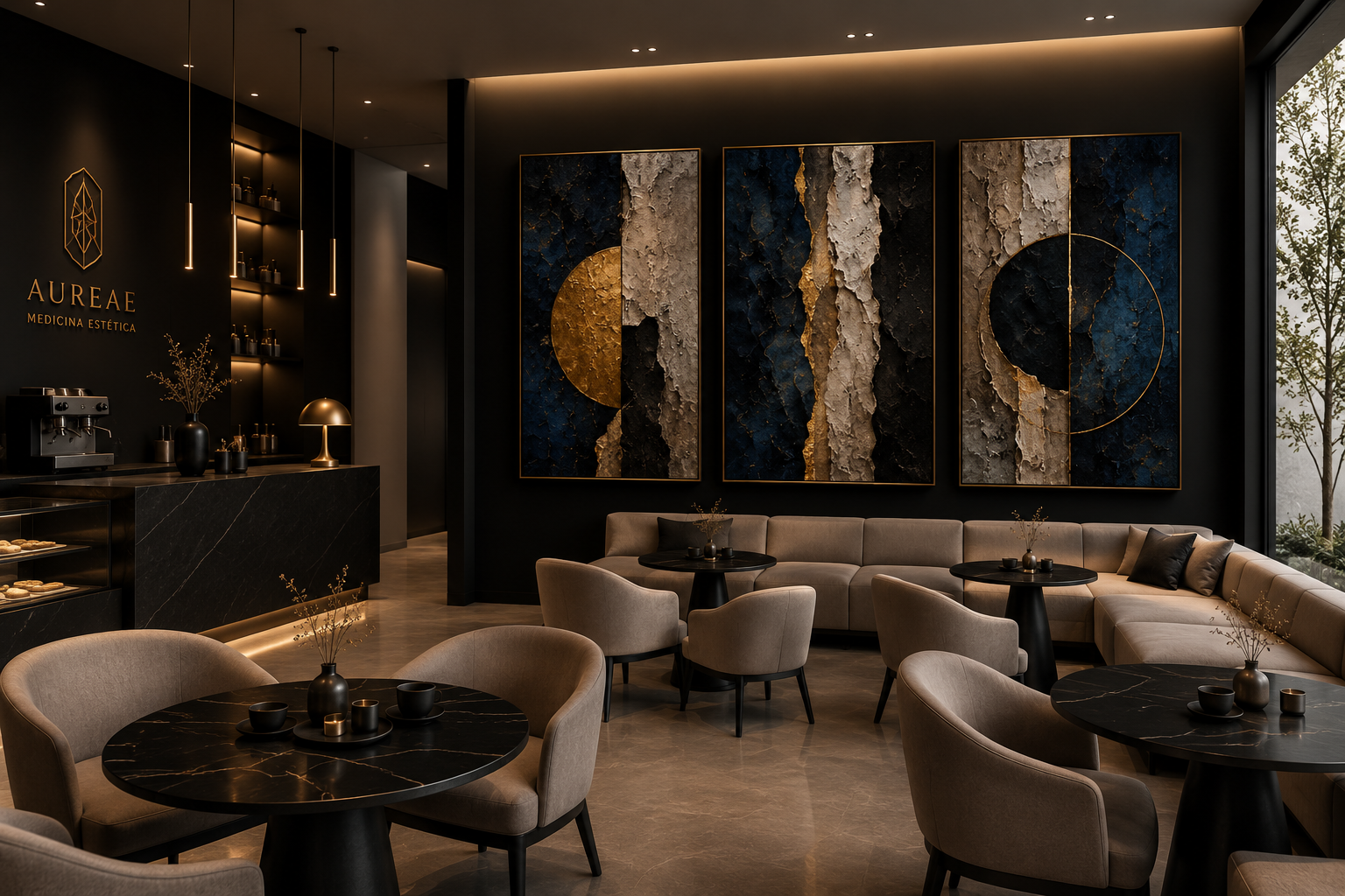
The new identity is built on a central concept: the body as form, proportion and matter. Surgery is understood as a sculptural intervention on the body's form. This idea extends into the clinic's space, which becomes a permanent gallery for a collection of works conceived specifically for the clinic's identity.
Applied art stops working as decoration. Reliefs, eroded surfaces, geometries and material compositions establish a direct relationship with the clinic's identity. The golden ratio, besides giving AUREAE its name, structures the formal language of the identity and the logo.
The space is organized in two registers: common areas and consultation rooms in chocolate, dark coffee, stone, wood and aged gold; patient rooms in ivory, sand, warm white and Mediterranean blue. This duality creates an experience that moves from the intimate and enveloping to the luminous and contemplative.
The result is a shift in positioning: AUREAE no longer competes visually as just another aesthetic clinic, and instead builds a recognizable spatial identity, designed also for medical tourism and for the companions who are part of the experience.
From a generic clinic to a spatial brand: medicine, applied art, architecture and hospitality integrated under a single art direction.
The art direction redefines AUREAE as an aesthetic medicine clinic conceived as a boutique experience space, bringing together medicine, architecture, applied art and boutique hospitality.
VIEW THE LIVE SITE
More cases
Explore
More improvement and positioning cases
for boutique brands by Ković