
.png)
.png)
Case Study: Rebranding a Boutique Alternative Wellness Brand
THE STARTING POINT: BEFORE ART DIRECTION
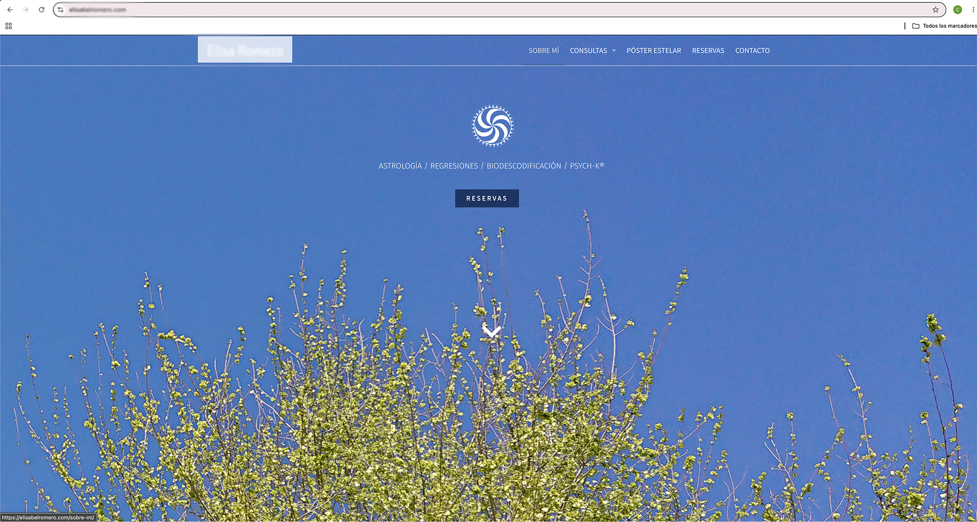
PREVIOUS WEBSITE: The project started from a website with no brand. The absence of an editorial strategy, an offer structure, art direction and an identity system turned navigation into a string of content unable to communicate a value proposition. The site did not differentiate, did not position and did not build a recognizable perception of the brand.
THE CRITICAL READING
DIGITAL EXPERIENCE: The digital experience was practically non-existent. Navigation was reduced to a string of static blocks with no hierarchy, intention or narrative structure. Usability suffered from legibility, contrast and interaction issues, and the absence of experience direction prevented any meaningful user journey.
OFFER STRUCTURE: The offer lacked hierarchy, diluting the core proposition and making it impossible to understand the brand's true value. There was no commercial journey capable of guiding the user's decision.
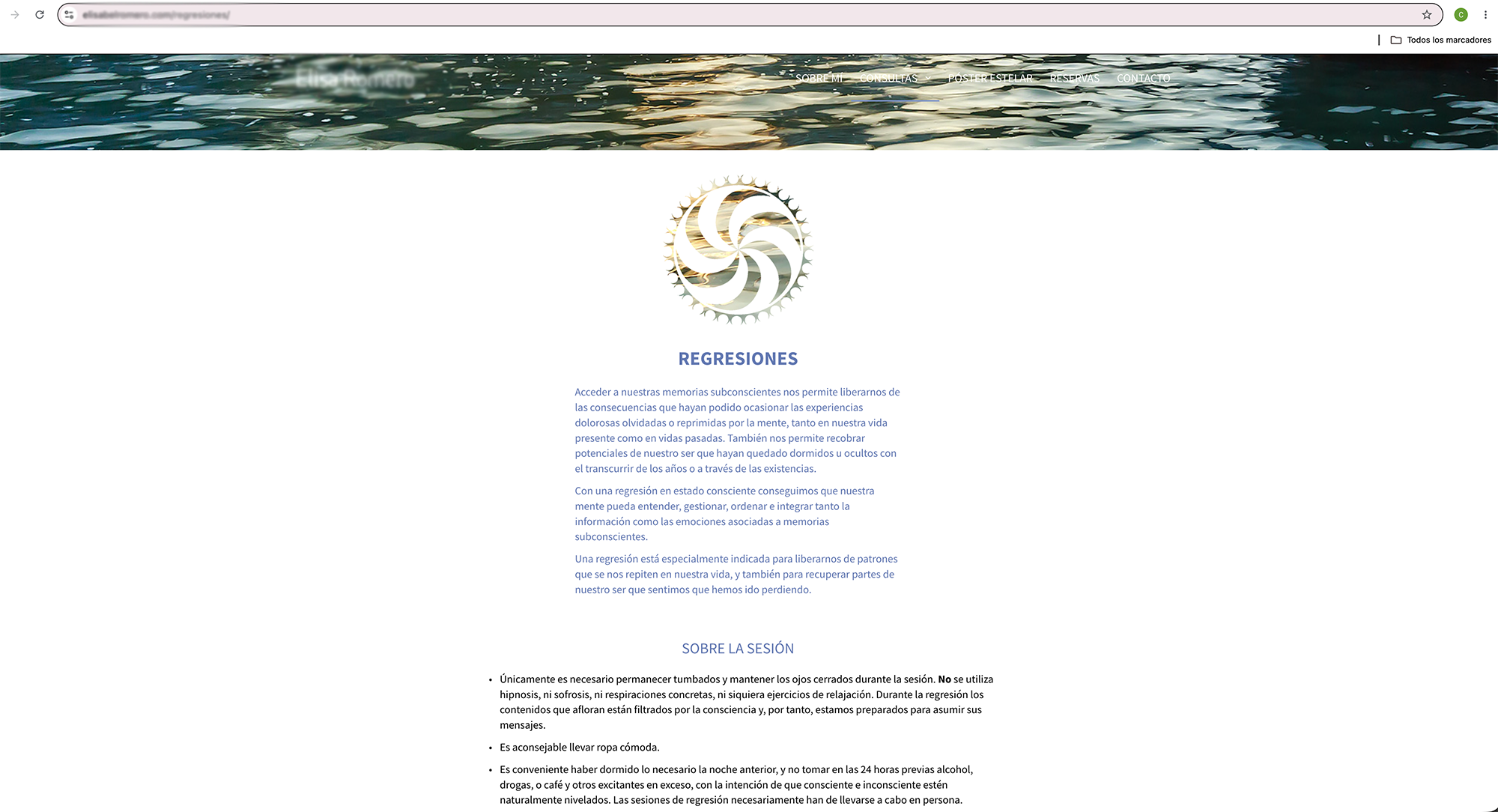
VISUAL IDENTITY: There was no visual identity. Typography, color, imagery, composition and visual style came from isolated decisions, with no recognizable language. The brand could have been swapped out without changing how the site was perceived.
BRAND VOICE: The copy was limited to explaining services in generic language, with no narrative of its own and no conceptual approach capable of differentiating the brand.
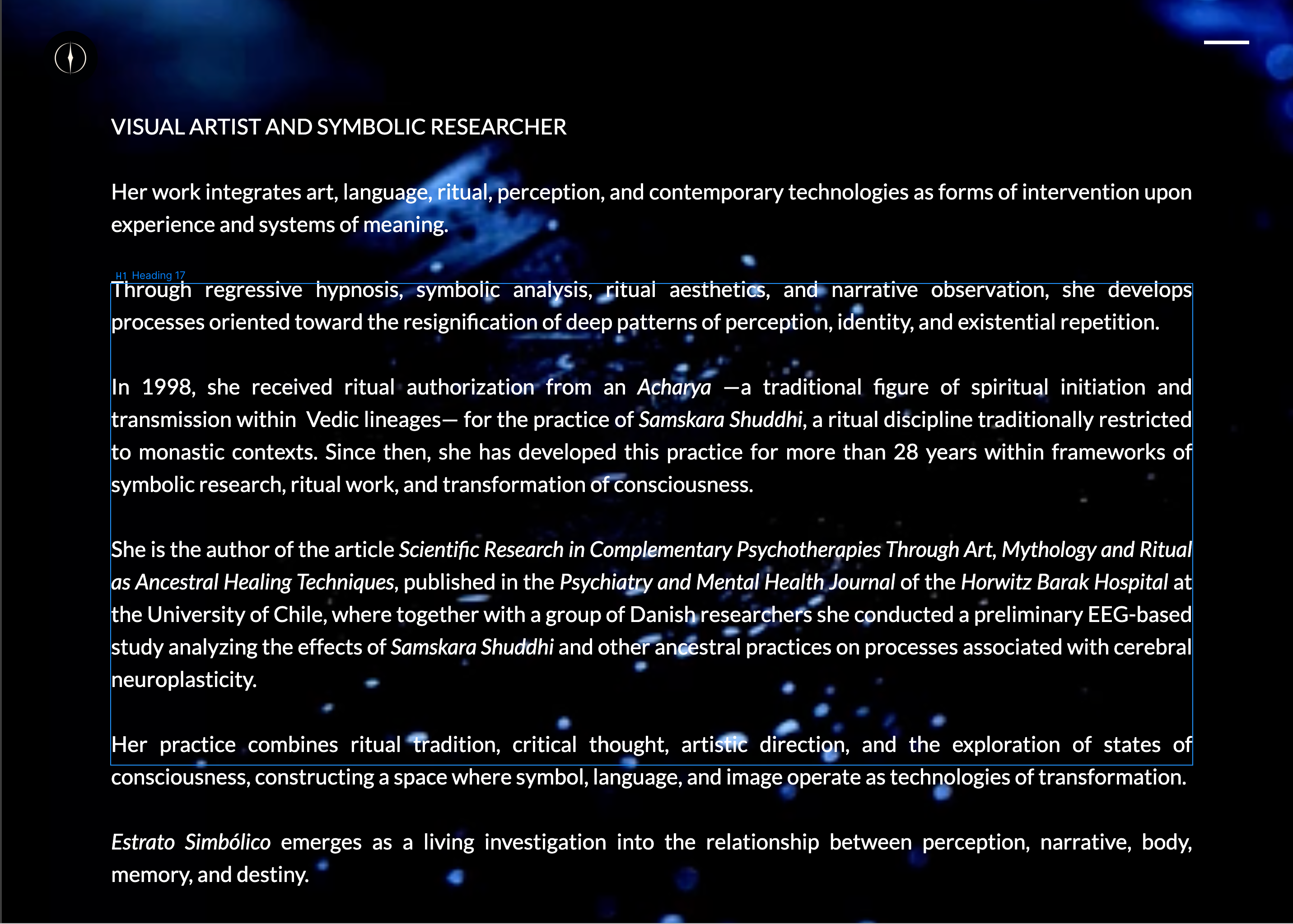
BIO (BEFORE): The biography was presented as a list of personal background details, disconnected from the brand strategy. The professional track record was not used to build authority or reinforce positioning, wasting one of the most valuable assets of the proposition.
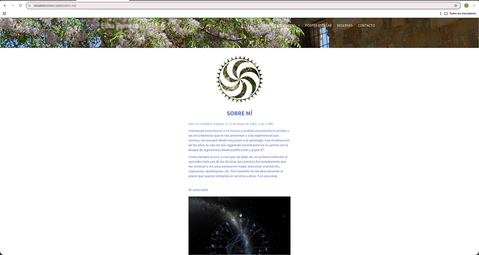
BIO (AFTER): The biography stops working as a personal description and becomes a strategic positioning tool. The artistic career, research and ancestral practice are woven into a single narrative, turning professional experience into an argument of authority consistent with the brand's conceptual universe.
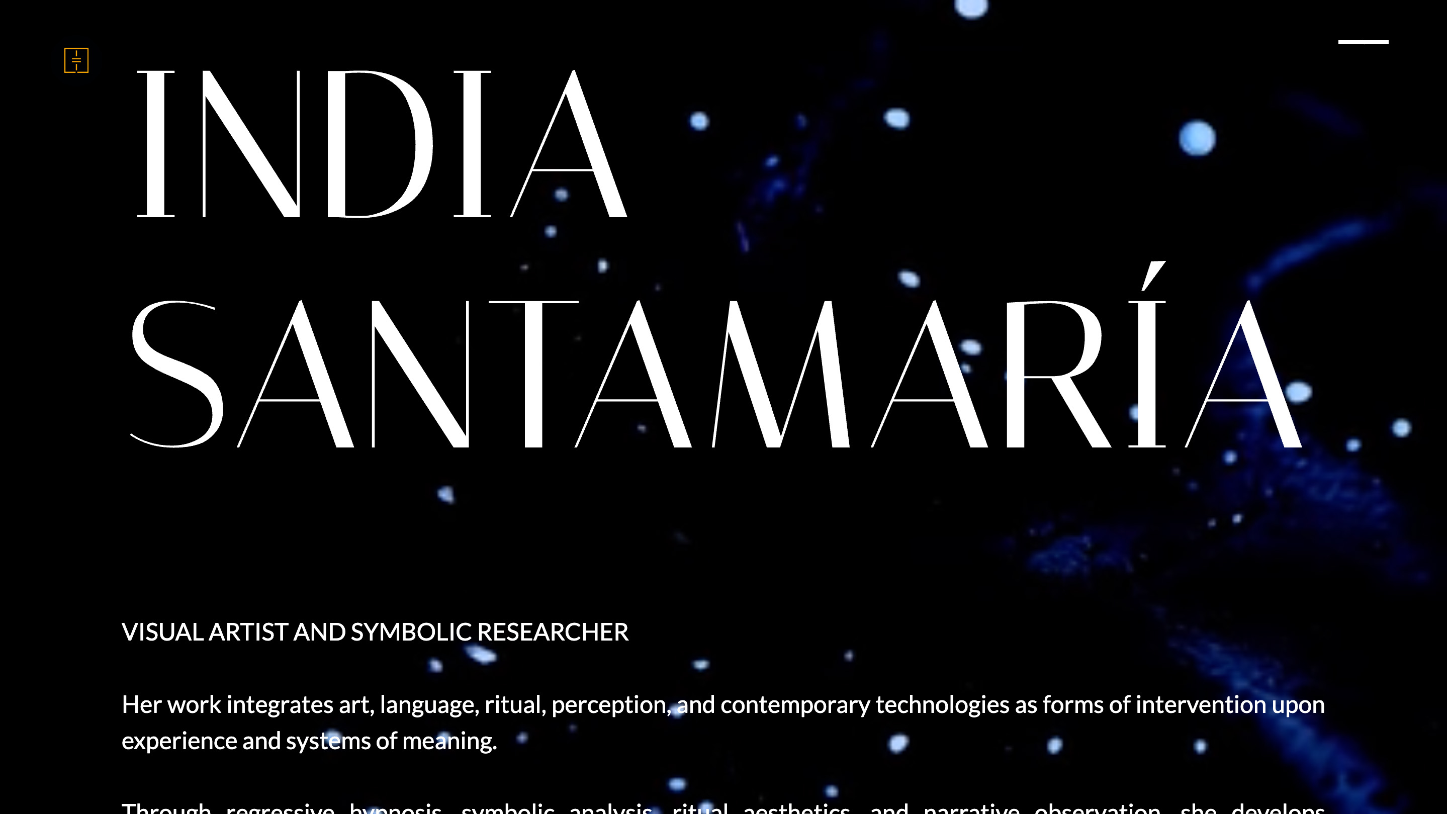
THE STRATEGIC DECISION
The intervention was not about redesigning a website, but about rebuilding a brand system. The strategy was built around one central decision: leaving behind the repetitive graphic resources and visual codes typical of alternative wellness to build an identity grounded in clear art direction criteria. Symbolic abstraction became the conceptual axis of the project, bringing together naming, positioning, visual identity, digital experience, brand voice, storytelling, copywriting and the editorial system within a single conceptual framework. The site was no longer seen as an information platform, but as an expression of the brand itself.
THE SYSTEM BUILD: AFTER ART DIRECTION
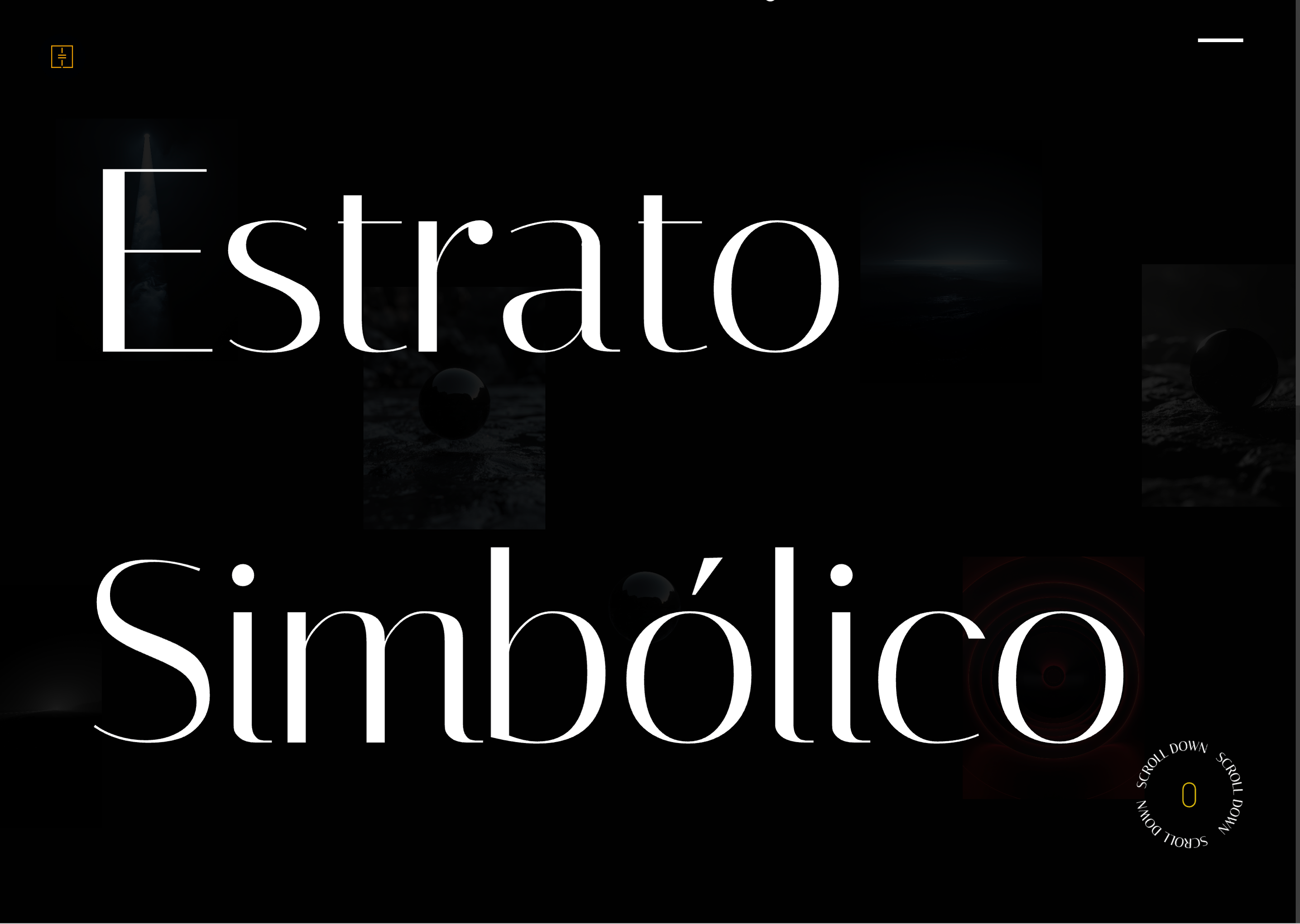
DIGITAL EXPERIENCE: Navigation was rebuilt as an immersive 2.5D journey in which movement, depth, interaction and spatial sequence become part of the brand's own discourse. Scrolling stops being a functional mechanism and becomes a narrative device that moves through the site's content through animation. Every transition, pause and change of pace is an art direction decision aimed at turning navigation into an experience.
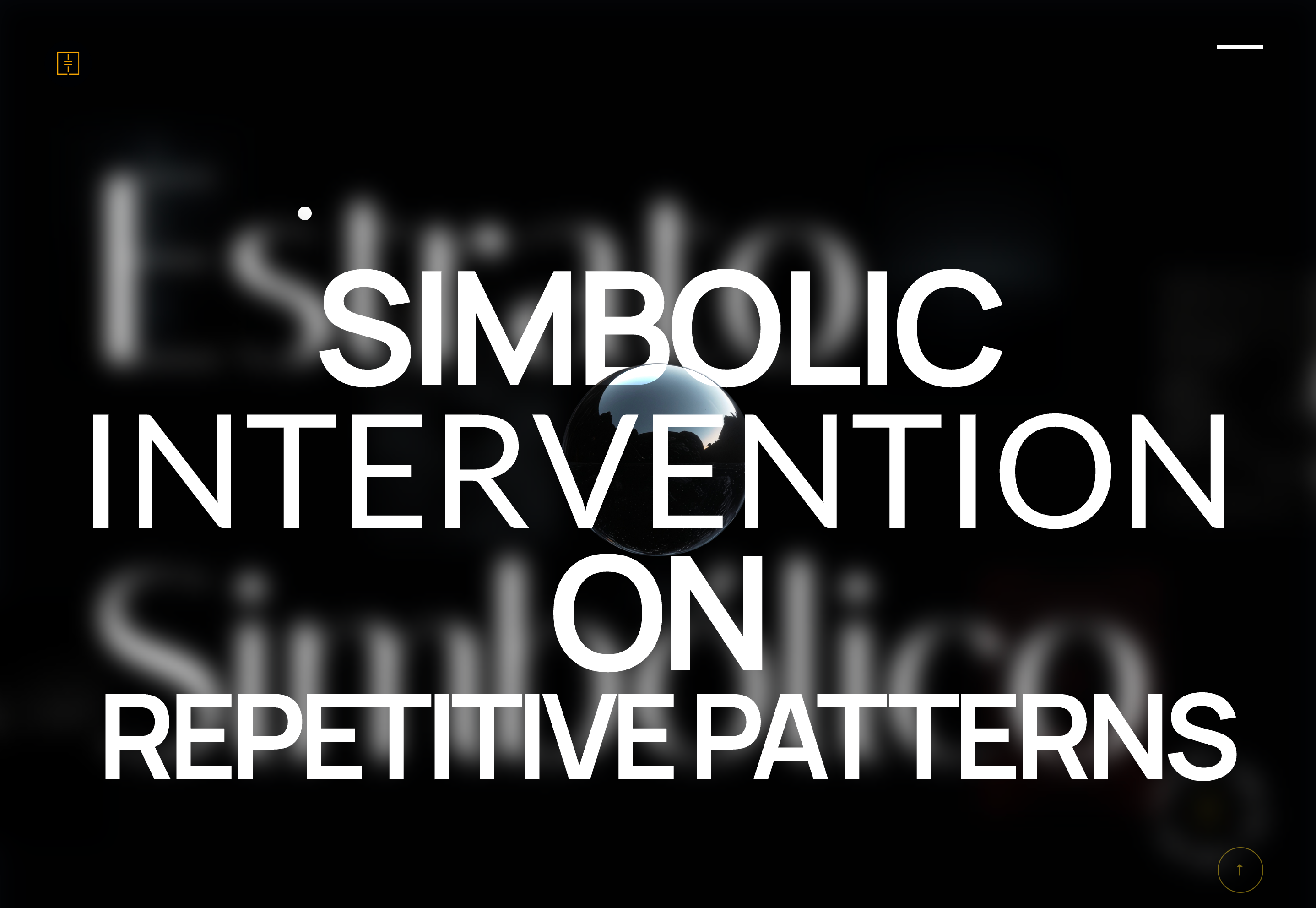
OFFER STRUCTURE: The offer was reorganized around a clear hierarchy. The main service became the core of the journey, while the other services are defined as extensions of the system. This reorganization creates a commercial structure consistent with the brand's strategic positioning.
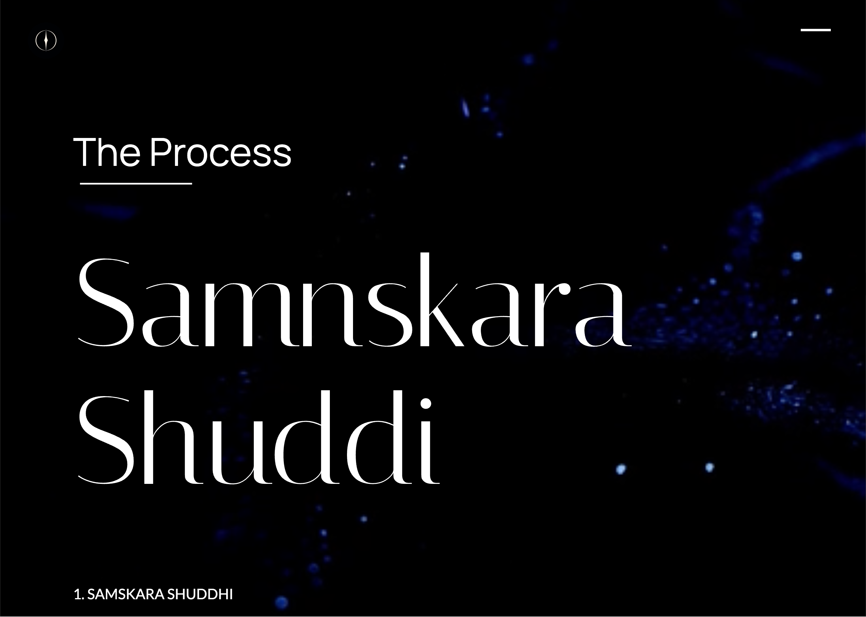
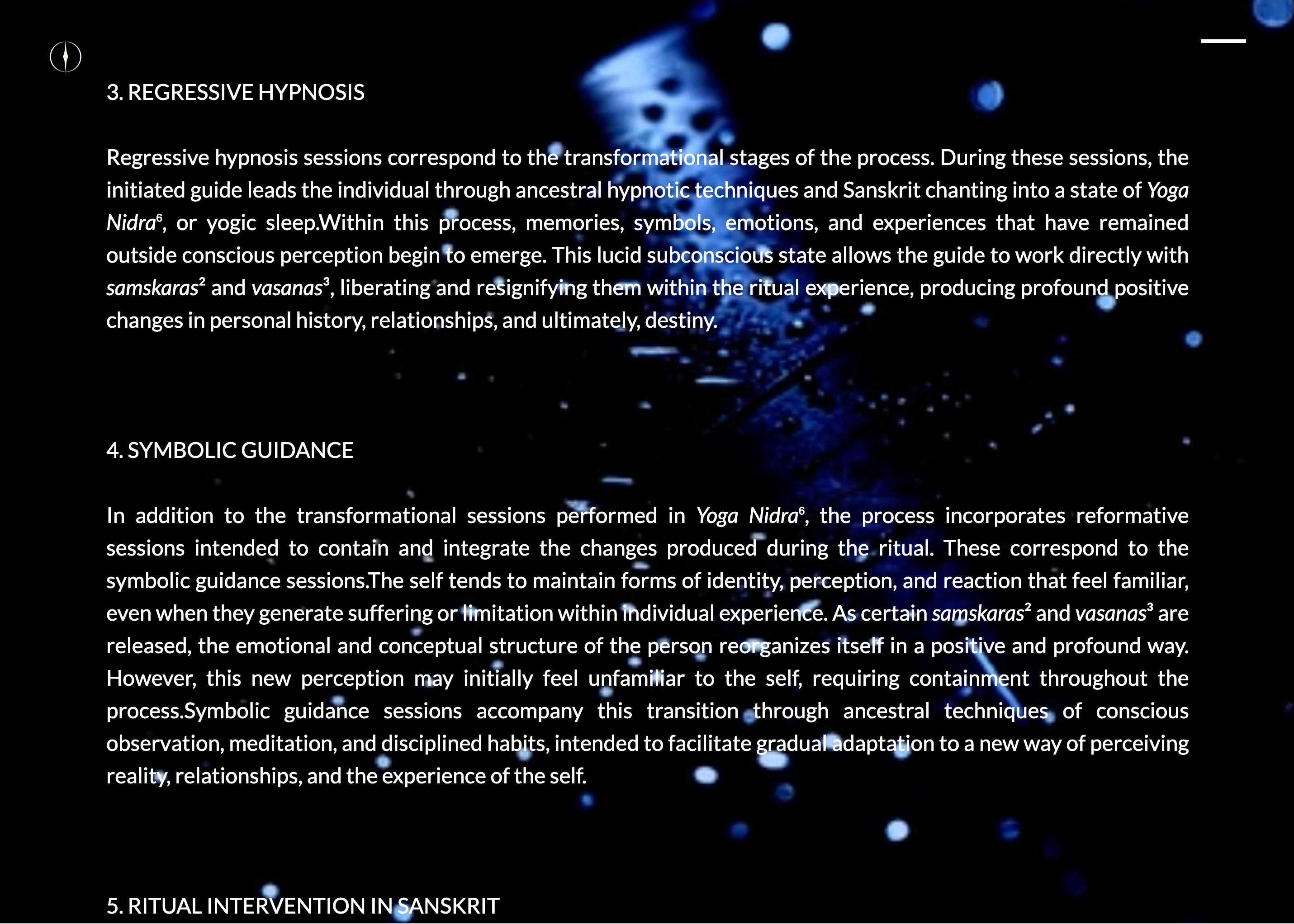
RESPONSIVE DESIGN
The mobile version is not an adaptation of the desktop site, but a complete rebuild of the experience. Composition, hierarchy, interaction and pacing were reworked to preserve the narrative intensity and the quality of the art direction on any device, ensuring a consistent experience throughout the entire journey.
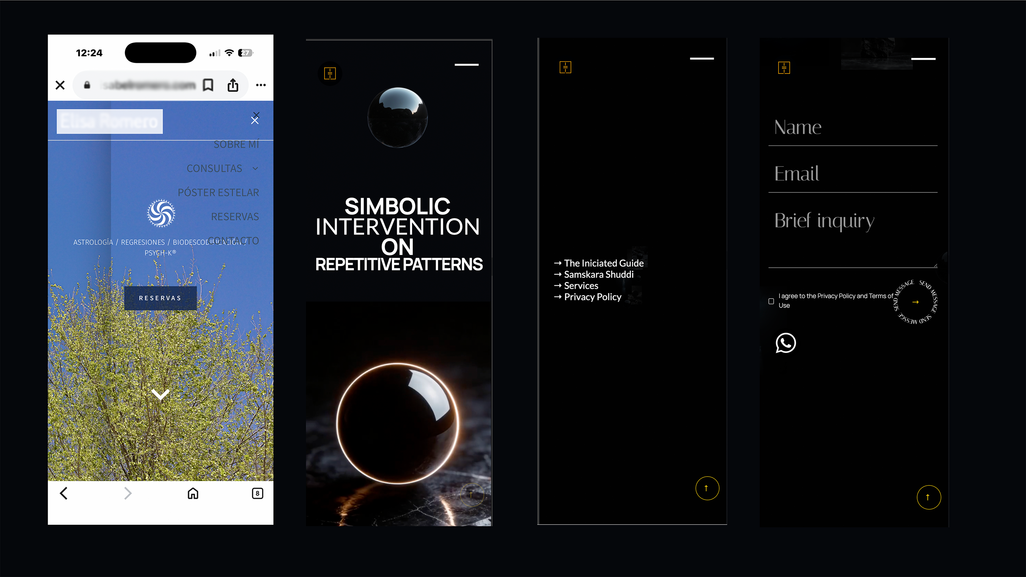
THE RESULT
The intervention turned a site with no brand into a coherent identity system in which strategy, art direction, digital experience, offer structure and communication work as a single structure.
The brand gained its own editorial voice, a recognizable visual language and an immersive experience that communicates its positioning from the very first interaction. Every touchpoint was designed to reinforce recognition, increase perceived value and consolidate a distinctive presence in a category dominated by repetitive visual codes.
The result goes beyond an immersive website: it is a brand system capable of sustaining a coherent identity across all its communication channels.
More cases
Explore
More improvement and positioning cases
for boutique brands by Ković